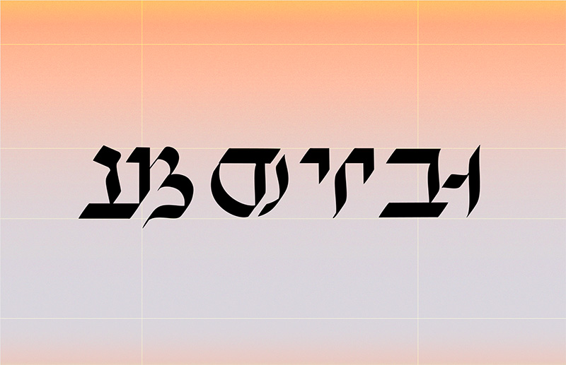
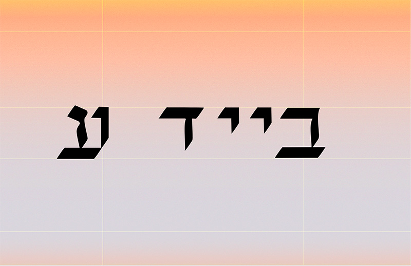
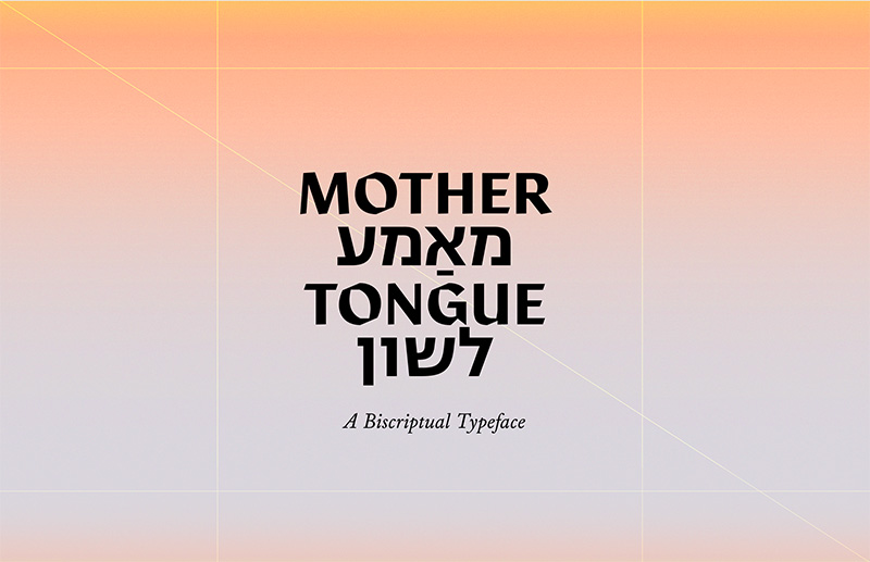
The starting point for my project was the experience of an ’inbetweenship’: to be in the middle of two cultures. If language is a culture-bearer and typography the body of language, as a graphic designer I was curious about what typography could be created from this intermediate position. In particular, I wanted to work with methods, tools, and expressions belonging to a Jewish heritage to change my conditions for type construction and language. I have explored the typographic ligature as method and form; historically created to save time and space in typesetting, but here used to find common denominators between two structurally different scripts. One question in particular has guided my process: can I create something whole from an intermediate position – something that isn’t one or the other, but a third possibility?
The result is a calligraphic typeface with hybrids of Latin and Hebrew letters that can be read from left-to-right in English, as well as right-to-left in Yiddish. Based on my own poem about the inbetweenship, the visual appearence comes from the codependency between the two scripts, a well as the compromises a merge entails. This way, it doesn’t only represent my own hybridized experience but also the Jewish experience at large, shaped by influences from other cultures and languages over centuries of flight and migration.
Read more and download the typeface at mother-tongue.info


